Tuesday, March 24, 2009

IVP2ELizaFrench

Spectacle Spinoff

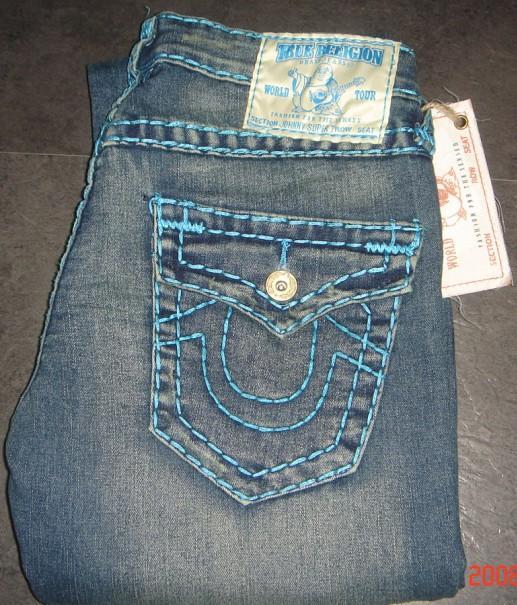
Concept: I based the game on ideas about people in society as consumers of images. In particular, I was interested in looking at how society appropriates signs, symbols, images for consumption, removing them from their original context and changing (or stripping them of) their respective meanings.                                     I chose twelve images in their original context and their counterparts in contemporary culture. Examples include: the chevron symbol (on ancient Greek pottery and as the logo of the oil company), graffiti (on a street wall and also stylized paint over a Louis Vuitton monogram bag designed by Marc Jacobs to commemorate Stephen Sprouse), and the Buddha (in the form of a gold temple statue and as a cartoon on the label of True Religion jeans). 


Inspiration: The inspiration for the game comes from a few different sources. The title is, of course, a not-so-subtle nod to Guy Debord’s “society of of the spectacle.” In my Avant-Garde Fashion and Literature class, we read essays on continental aesthetics by different theorists, many of them Marxist. We discuss the re-emergence of imagery from different cultures and time periods in the context of contemporary fashion. I also went to a lecture by Catherine More, owner of Dogstar Tatoos,  about the works in the “Escultura Social” exhibit at the Nasher. She talked about how many popular tattoos in mainstream popular American culture are recycled images from other cultures or times, and many of them loose their significance when re-produced on bodies over and over again. Furthermore, she also discussed the difficulty of creating a truly “original” image as an artist in today’s society because of our rampant consumption of images, made possible in part by digital media.  
While working on this project, I considered a few resources about games, including: the online archive of a 2004 Cornell exhibit about games in the context of their historical development and social functions,  a blog running since 2004 about “fun”  that has posts on material ranging from classes at universities about games to an entry about The Fluxus Olympiad at the Tate Modern, and a unique book dedicated to the subject of game creation, The Game Design Reader: A Rules of Play Anthology, edited by Katie Salen and Eric Zimmerman, with predominantly professional and academic essays about games of all kinds, including computer games.

Logic and Method of Design: All of the design features of the game are designed to mimic imagery of commercialism in consumer society. I made the gameboard by cutting metal foamboard with a knife and coating it in silver acrylic paint. To create the spinning wheel, i modified a color wheel by covering the inside with white paper, affixing the "original" images to the bottom layer of the wheel, and covering the top with layers of paper I painted with acrylic gold paint. I attached the wheel to the face of the board along with the "appropriated" images I use as space.                                                                                                                             I intentionally crowded the board with flashy paints and oversized images to mimic the effect of the constant and simultaneous consumption of (often unrelated) images within our society The metallic paint and bright images not only mimic  the brash, attention-grabbing style of popular advertising imagery, but also symbolize the “newness” society relentlessly demands . The shiny, reflective surface of the wheel and light of the glow sticks will highlight the images, but might also overwhelm the viewer with too many metallic and bright colors, which is often what actual advertising imagery does.         

 The wheel echoes the revolving nature of images within our changing cultural context. As it spins over all the images, the players see each picture flash by before them as a revolving collage of random images. The digital coding on the back acts as a uniform pattern. It is in a plain font to highlight the simplicity of the coding that underlies these complex images and create a stark contrast to the garish decoration of the top of the board. It is supposed to remind the players of digital consumption, recycling and appropriation of images. 

Rules of Play: This game is intended for 2 players or 2 teams. 

1.  Each player/team chooses to represent Prevalence in society or Commercial Value. Make sure the wheel is in starting position, with the logo facing upright.                                                           

2.   Instead of rolling dice to start playing, Player/Team 1 spins the wheel. The wheel will land on a random “original” image. The original image that the player/team lands on has no attached value because the appropriated images are the ones that dominate in consumer society.

3.   The corresponding appropriated images will be “spaces” on the board. They will be organized in two ways. The first will be on the images’ prevalence within our consumer society, the second will be its commercial value. Player/Team 1 places their place marker, which can be any US coin, not provided in the game package, on the corresponding appropriated image under whichever category the player/team chose (Prevalence or Commercial value).


4.   Note the assigned point value of that space on notepad or paper.

 5.   Player/Team 2 does the same thing.

 6.   In the event that the player/team representing Prevalence moves the space with the highest assigned point value and the team representing Commercial Value has fewer points combined, the player/team representing Prevalence automatically looses. This is because once society becomes super-saturated with an image, we look for something else to consume

 7.   The player/team representing Commercial Value can only lose if they land on the original image corresponding to the appropriated image with the highest point value, and the total value of the Prevalent player/team is less than this value. 


No comments:

Post a Comment